One can’t utter the words web accessibility without mentioning the WCAG guidelines. They are a great resource, but trying to interpret them to make your website accessible can be intimidating.
The Web Content Accessibility Guidelines (WCAG) govern the standards for accessible web design. And because those guidelines are extensive and can be intimidating, we’ve put together a list of 10 concrete ways you can improve your site’s accessibility across the board.
🧰 🔧 Download our free Drupal web accessibility ebook to gain valuable tips and tools for your accessibility journey.
What are the Web Content Accessibility Guidelines?
According to the W3 consortium—the body of internet regulators behind the guidelines—WCAG “defines how to make web content more accessible to people with disabilities.” It offers principles, guidelines, success criteria, and techniques for creating accessible experiences on the web, published in the form of an incredibly lengthy document that we read so you wouldn’t have to (but if you’d like to, here’s the latest version of the Web Content Accessibility Guidelines in full).
The most important part of the guidelines are the four foundational principles of web accessibility:
- Perceivable
- Operable
- Understandable
- Robust
Keep them in mind as you work to improve your own site’s accessibility.
10 Ways to Improve the Accessibility of Your Drupal Website
Here’s a list of 10 ways to increase web accessibility across the board, before you start wading through all the nitty gritty details in the WCAG:
1. Follow a Logical Page Structure
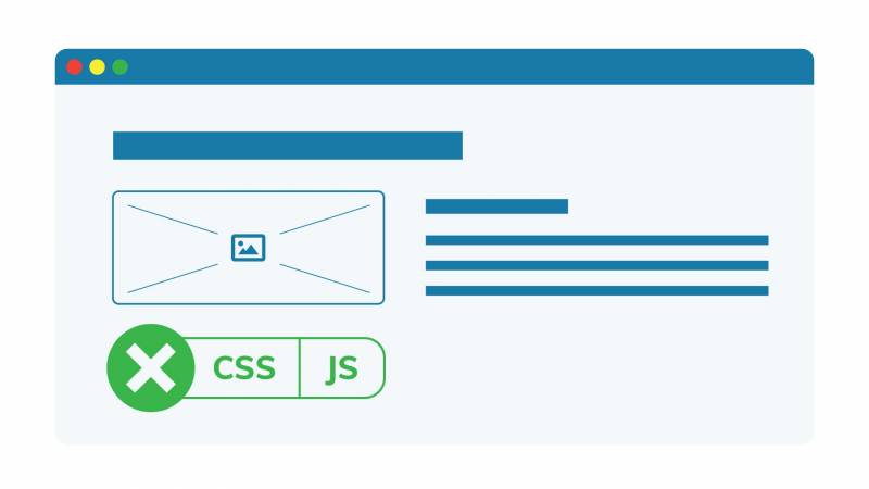
Well-structured and well-organized content will make it easier for everyone to navigate your page and take in your content.
Taking the time to structure your user interface and properly prioritize information can really pay off, and will be especially appreciated by readers who use assistive technology like a screen reader to access your content. No one wants to sit there guessing what the difference is between your three main menus. This W3 article has some good tips on how to properly structure your page.
If you turn off CSS and JavaScript, you can get an idea of how your web page “looks” to someone using a screen reader.
CSS allows you to position elements wherever you want on the page visually, regardless of where they are in the code. However, screen readers skip that “cosmetic” layer and rely on the page’s underlying structure to guide their users. The same goes for JavaScript: it allows you to manipulate elements by hiding them, removing them or showing them, but the web page won’t appear the same way it does visually to a screen reader.
2. Use HTML Semantic Markup and ARIA Landmarks
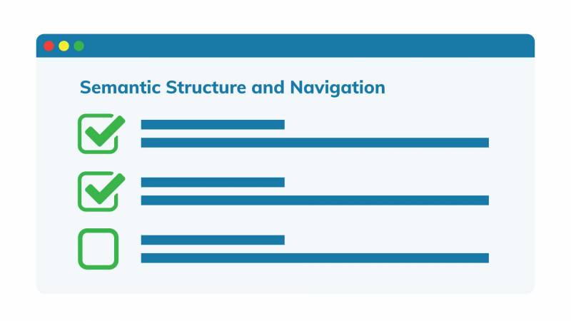
Always use native HTML elements to make the website more accessible when available. You should use HTML5 tags to mark up the main sections of a page (footer, header, navigation, main, etc.), as well as sections, paragraphs and lists.
HTML tags can be used to tell a computer about the content of a website and can make navigating using a screen reader much more accessible. There are four main types of tags you can use to help machines understand what’s on a page and how to interpret it:
- Document structure tags, which identify the different regions of a page(e.g.
<header>,<footer>,<nav>) - Textual meaning tags, which provide details about text formatting (e.g.
<h1>,<strong>,<blockquote>) - Media type tags (e.g.
<audio>,<video>) - Correlation tags, which define how items relate to each other (e.g.
<ol>,<ul>)
This page has a good checklist of HTML elements and attributes to use for accessibility.
When HTML markup is not sufficient, use WAI-ARIA markup.
ARIA (Accessible Rich Internet Applications) is a set of attributes you can add to HTML elements to make them more accessible for users who use assistive technologies. The first rule of ARIA is don’t use ARIA. If there’s a way to do it with semantic HTML, that’s always a safer bet.
Drupal has built-in accessibility-focused features, such as additional semantic HTML5 elements that can be used by assistive technology devices like screen readers. It also supports WAI-ARIA landmarks as well as other useful markup options that provide context for all types of content. If your goal is to build an accessible website, there is no better platform to start with than Drupal.
3. Break Content Down Using Headings
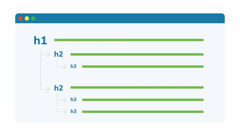
The proper use of headers is another element that goes a long way in helping to structure your page and making it easier to navigate. Headers break pages down visually and make them easier to scan, in addition to allowing users with screen readers to skip to the section they want.
The <h1> element denotes a main heading, and there should only be one per page. The <h2> tag indicates subsections beneath it, and further embedded subsections of that are labelled with <h3>, with <h4> embedding your content even further, and so on.
This blog post has useful details about how to structure your headers. Just don’t be tempted to skip a layer and add a <h4> beneath an <h1> because users (and screen readers) might end up confused.
4. Build Better Forms
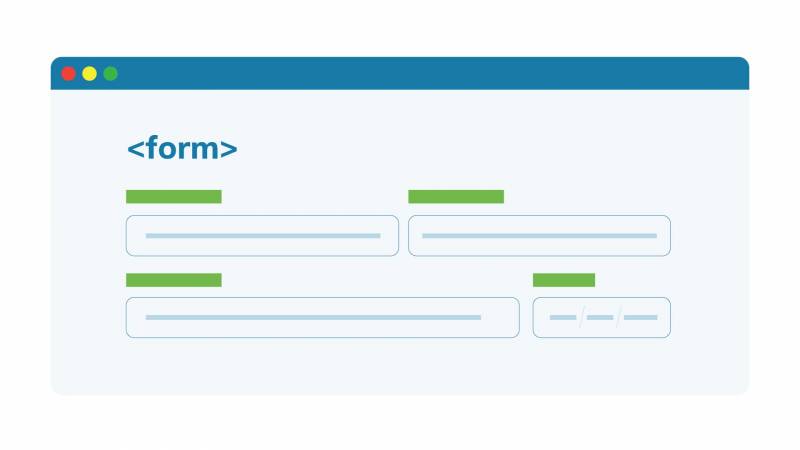
Form design is deceptively tricky, as it introduces a lot of potential barriers to accessibility. For example, it’s essential that forms be fully usable through keyboard navigation to account for those unable to operate a standard mouse. Provide overall instructions about filling out the form before the <form> element since screen readers usually switch to ‘Forms’ mode when they encounter a form.
Each field in the form needs to be properly labelled and the label needs to be in close proximity to the input box for that field. Also make sure any additional instructions are outside the box and not placeholder text inside.
Take a look at Drupal best practices for building accessible forms. Basically, when you’re building a form, it’s one place where you don’t want to think outside the box.
5. Describe all Images
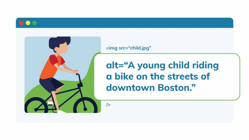
Users who rely on a screen reader to access your site need a way to understand image content, which is typically added as the alt text attribute. The general rule of thumb is to ensure all images are accompanied by a descriptive <alt text>.
For example, if you have a picture of a young child riding a bike in downtown Boston, the alt text should be something to the effect of “A young child riding a bike on the streets of downtown Boston.”
If the image is a functional image which denotes an action, such as magnifying glass to represent a search action, it should indicate the action in the alt text, saying “search.” The exception to all this is purely decorative images that don’t contribute to understanding the page’s contents: you can keep the alt text empty for these.
Keep your alt texts snappy. A picture is worth a thousand words, but in this case, 140 characters is usually enough. Get all the details in our post about accessible images.
6. Be Wary of Tables
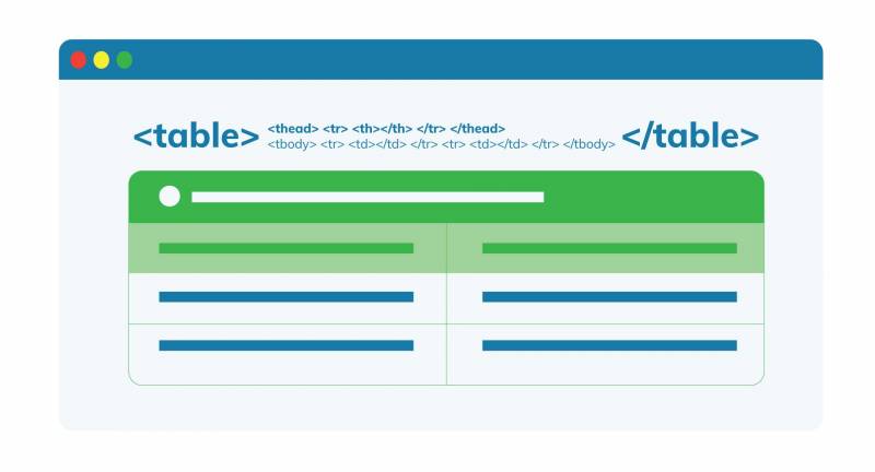
Only use tables when absolutely necessary. Never use a table as a layout element or to display lists.
Misusing tables can make pages difficult to understand for a variety of assistive technology tools. Use tables to display data with a logical relationship that is best represented in a grid. To make tables more accessible, mark headers with <th> and cells with <td>.
Queen’s University’s Accessibility Hub has a good overview of table best practices if you want more details.
7. Enable Keyboard Navigation
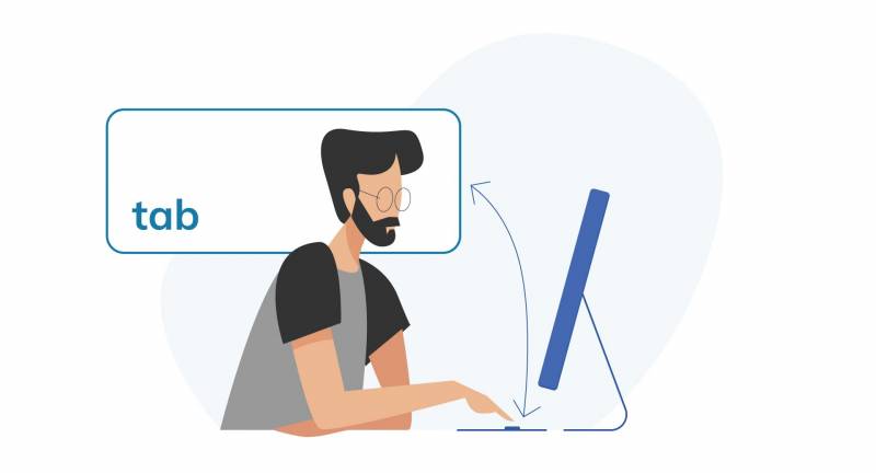
Make sure your site can be navigated with only a keyboard. Some users cannot use a mouse, and certain assistive technologies do not allow for precise clicking or hovering. Or maybe the user’s trackpad just stopped working.
To make sure that your website can be navigated using a keyboard, tab through the site using your keyboard. As you tab through the site, check that there is a focus ring (usually a light blue outline by default) around focusable elements (buttons, links, form inputs, etc.) and that the keyboard focus order matches the visible focus order. Remove any off-screen focusable elements.
If you’re still not sure how to make your site more keyboard-friendly, this Designing for Keyboard Accessibility checklist from the University of Washington should help.
8. Add a 'Skip to Content' Link
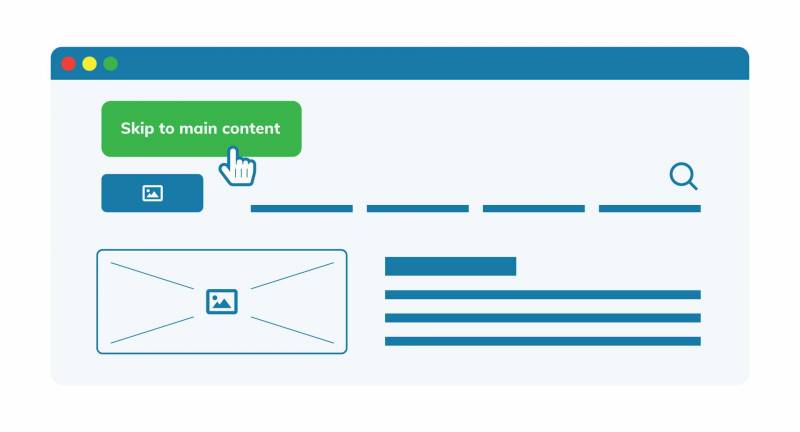
Another great way to improve site accessibility is to add a ‘skip to content’ link. When tabbing through a screen to access content, it can quickly become tedious if you have to go through a ton of repeated elements in the header of each page before getting to the main content.
A ‘skip to content’ link provides a keyboard-supported means of bypassing these repeated elements to access the main content, making navigating your page with a keyboard or while using a screen reader much easier. Trust me, if you’ve ever heard a screen reader reading your mega-menu items every time you land on a page, you’ll jump at the chance to let users skip to the good stuff.
You can find details about this practice in the WCAG section guide to Adding a skip link at the top of each page.
9. Design Accessible Interfaces
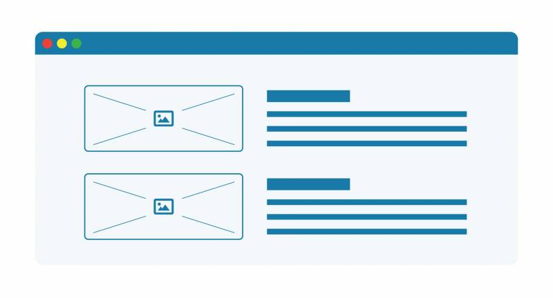
Certain design elements can also help improve accessibility. We’ve written a more detailed explanation on how to keep the design elements of your website accessible, but here are a few quick tips:
- Ensure there is enough contrast between the text and the background
- Consider using a sans serif font to improve the legibility of longer text
- Make sure the font is large enough and enable resizable text.
- Ensure adequate spacing between each line of text, between paragraphs, and between all other elements on the page.
10. Offer Alternatives to Audiovisual Content
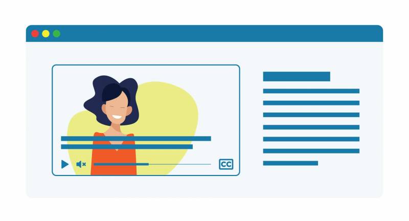
It's always best to provide alternative ways for users to access essential media on your site. You can also consider removing non-essential media altogether.
Captions, for instance, can benefit everyone, so make it a rule to caption all audio and video content. Sometimes users would prefer reading captions to watching a video with the sound on, whether they’re in a library, at work, or on a busy subway. Similarly, including an audio description of the key visuals in video content can also make media more accessible.
Some video platforms, such as YouTube, have auto-captioning features that use speech recognition to caption videos. These technologies tend to be less than perfect though, so while they can be a good start, it’s always best to manually review the auto-captions.
Another best practice is to disable automatic playback for all media. There is nothing more annoying than trying to figure which open tab that noise is coming from. Imagine how much more annoying it is for someone who relies on a screen reader and keyboard to navigate.
Finally, avoid using patterns like quickly flashing media, which can trigger seizures in some users. If you need more tips on how to make media accessible, take a look at this page in Drupal’s accessibility documentation.
In Conclusion
With this list in hand, you won’t suddenly become an accessibility expert, but you will be one step closer to making your website more inclusive.
And if you do want to become a web accessibility expert, consider signing up for our in-depth accessibility training to learn more about incorporating accessibility standards in your Drupal design and development practice.

