In the last few projects I've worked on at Evolving Web, we've come across a common requirement: having a collapsible section of the site on mobile devices containing the site's logo, a menu and other Drupal blocks. The Responsive Menus module is quite popular, but it only works with menu blocks - no logo, no custom text. Since we couldn't find any contrib module to solve the problem, we wrote some custom JavaScript to integrate a JavaScript plugin called Sidr, which inspired me to write a Sidr integration module for Drupal. In this article, we will discuss how the module works and how you can get it working in your next project.
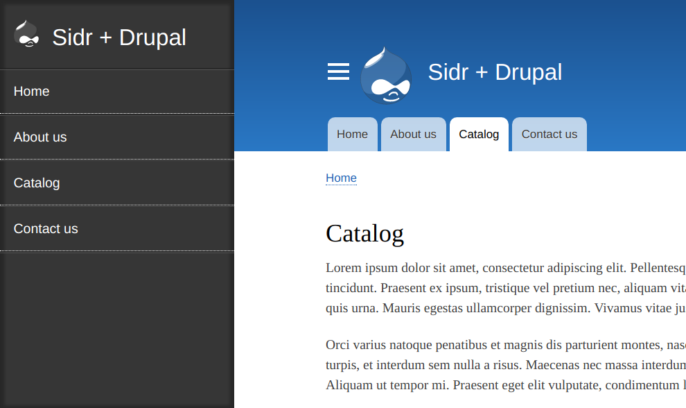
Here's a screenshot from a quick demo site I prepared. You click on the hamburger menu, and the black sidr region appears on the left. You click it again and the region slides back out.

Installing the Sidr module and libraries
To install the module, we must install the module files and then the Sidr libraries.
- Download the Sidr module into the
modulesormodules/contribdirectory in your Drupal project and install the module - Install the Sidr libraries
- Download the version of Sidr recommended in the module's README file, which at the time of writing this article is Sidr 2.2.1
- Once downloaded, copy the
distdirectory in the Sidr project to the libraries directory in your Drupal project and rename it tosidr - At this point, there should be valid JavaScript file at
DRUPAL/libraries/sidr/jquery.sidr.jsand the Drupal status report page should show the Sidr libraries as Installed

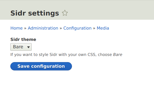
- Configure the Sidr theme from the
admin/config/media/sidrpage. Here's some quick info about the themes:- The dark (default) and the light themes are provided by Sidr. These themes give you some CSS to start with, but you still need to write some CSS to fine-tune the appearance.
- Typically, for a project with a custom look and feel, you'll use the bare theme. This provides minimal CSS, allowing you to style the
.sidrelement and its children in your theme. Yeah!

Congratulations! You now have the module installed. All that's left now is a bit of configuration.
Configure collapsible content
Depending on the project requirements, you might have one or more sidr instances. For this article, let's say you want a sliding panel on the left with the following contents:
- Site logo (the site branding block).
- The main menu (the main menu block).
We can achieve this using two different approaches:
With a custom region (recommended)
Create a custom region named, say, Drawer (Left) in your theme where you can place whatever blocks you want to show in your Sidr. We will then configure the Sidr plugin to use the contents of this region to populate the collapsible panel (discussed below).
Note: Make sure you hide this region using CSS because Sidr will copy the contents of the region in to a div.sidr element during its initialization.
Without a custom region
If all your blocks are already present on your page, you can use multiple jQuery selectors in the Source configuration for the Sidr trigger block (discussed below) and the Sidr plugin will copy the contents of those elements and put them in the Sidr. Sidr will not copy the elements for the jQuery selector, but all of their children. This is the reason why I prefer to use a custom region. Using the above-mentioned custom region approach, you can preserve wrapper elements which give you nice CSS selectors for theming your Sidr.
Configure a trigger button
Now that we have set up the contents for the collapsible region, we are ready to create a Sidr trigger block. This trigger block will provide a button to open and close the Sidr panel. To do this,
- Go to the Block management
admin/structure/blockpage. - Click the Place block button for the region where you want to place the trigger button (usually somewhere in the header).
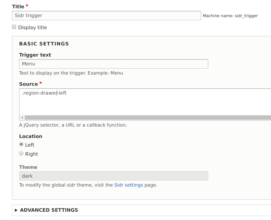
- Choose the Sidr trigger block, configure it and save it. Some of the configuration options have been discussed below.

Trigger text and icon
The trigger text is the text which is displayed on the Sidr trigger button. You can also enter some custom HTML in the Advanced settings > Trigger icon field to configure an icon, say, a hamburger icon or an <i class="fa fa-bars"></i>.
Note: It is compulsory to have either a trigger text or a trigger icon. You can also have both if you want.
Source
The source is from where the Sidr panel will be populated. It can be one of the following:
- A jQuery selector: If you provide a jQuery selector, the inner HTML of the selected elements will be copied into the relevant Sidr panel. You might be interested in the renaming option which makes Sidr rename the ID attributes of the copied elements to avoid getting repeated DOM IDs. Here are some examples:
- Using a custom region, source should look like
.region-drawer-leftor.region-drawer-rightor whatever you name your custom region. - Without a custom region, you will have to refer to various blocks like
#block-site-branding, #block-main-menu, #block-copyright-notice.
- Using a custom region, source should look like
- A URL: If source is a URL, the content on the URL will be fetched via AJAX and displayed in the Sidr panel.
- A callback: You can even provide a JavaScript function as the source, in which case, the contents returned by the callable will be used to populate the Sidr panel. If you do not like the idea of copied elements provided by the jQuery selector option above, a callback might give you more flexibility.
Most of the Advanced settings are optional and you can learn about them by reading the Sidr documentation. Once you have configured everything, all you'll be missing is some custom styling to bring your Sidr to life.
Feel free to leave comments about problems you face and any suggestions you might have. You might want to read the Sidr module's project page and issue queue for the latest updates.

