We at Evolving Web are really excited to see the progress being made on improving the Drupal admin UI. As a designer, I’m curious about the process that drives such a huge project. I talked to the designer in charge of the refreshed interface, Cristina Chumillas, and got super interesting insights into what’s behind the new design.
Claro – fresh and clear
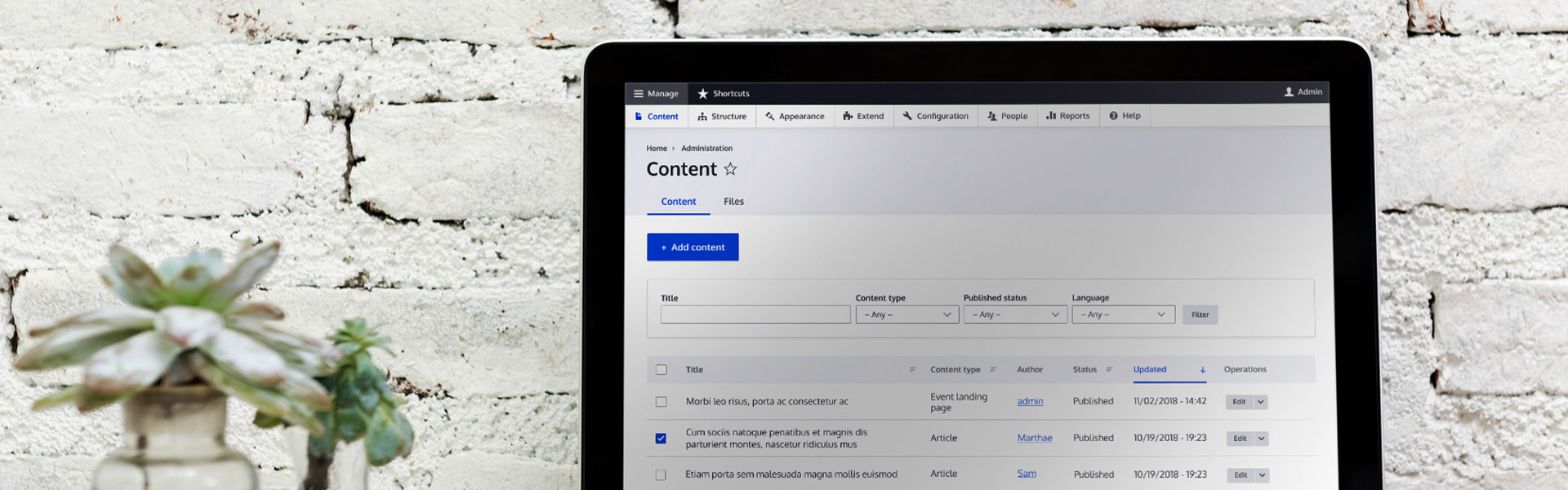
So far, Cristina and the team developed a new theme which is called “Claro”. The main UX problems in the existing admin UI have not been addressed yet. However, the visual refresh is already a great improvement! In Spanish, “Claro” means “clear” and this seems to be the main motivation.
I especially like the new colour palette that is a literal refresh with grey tones that are slightly bluish and a primary blue that is very lively. Compared to the old warm colour scheme, this simple step results in a much more modern look. The contrast has been increased a bit, which has several positive effects. It helps create a clear hierarchy and, of course, it helps make the interface more accessible.
Interaction Design Challenges
I asked Cristina about the biggest challenge in the redesign. She said that complying with the latest accessibility standards was a tough one.
“We are not designing for a private company, we are designing for Drupal and this means for anyone. The design has to be accessible for anyone.”
One example Cristina gave me was the form field designs. The initial form fields were similar to those in the Material Design system, with the label inside the input field. Once you select the field, the label floats to the top. It is an elegant technique that has become popular over the last few years. However, Cristina remarked that this kind of animated form design caused a problem with accessibility.
“We decided not to implement something that is super fancy.”
I appreciate the fact that the team behind the new Drupal design puts the user front and centre. The purpose of the redesign is not to create something original for the sake of being extraordinary. On the contrary, the goal is a clear design that prefers well-known design patterns over personality. This doesn’t mean that they kept the old form UI, which was mainly the browser default. The new form design is simple, but clear and therefore very usable.
Hierarchy & Proportions
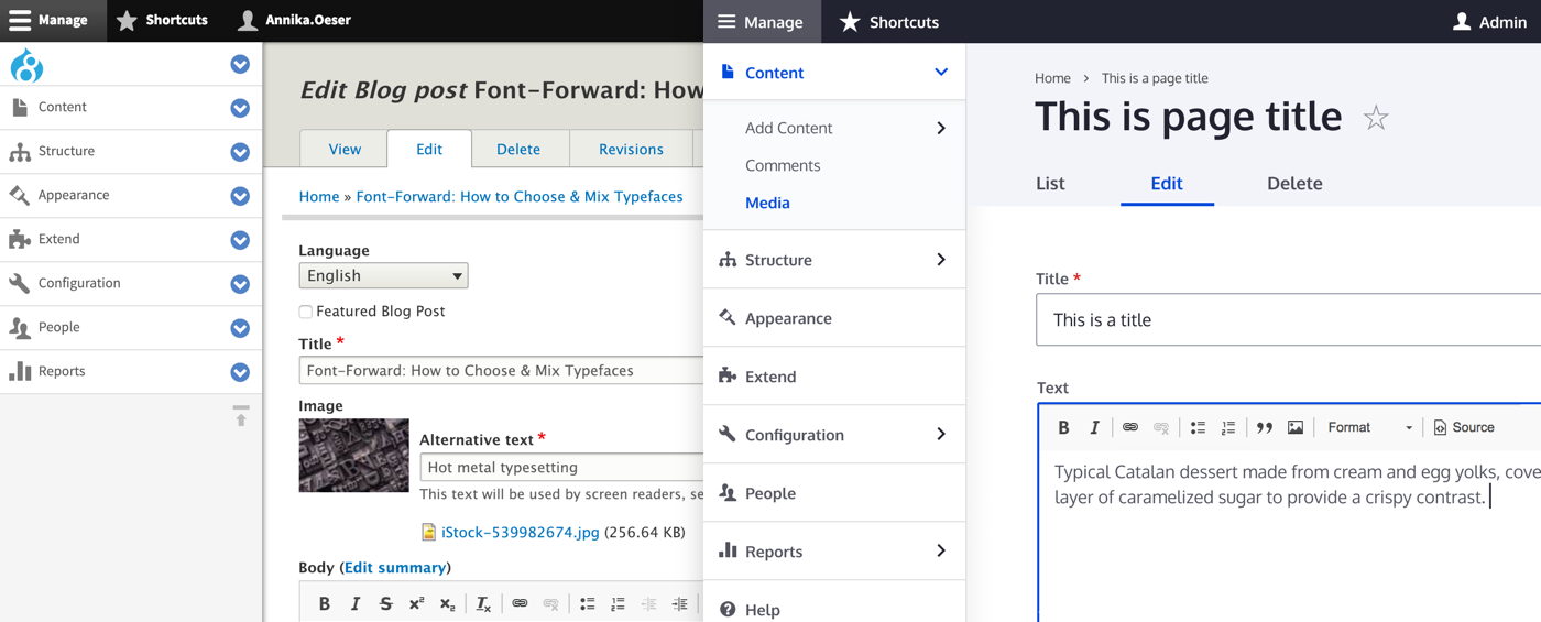
The new UI system is extensive. It includes different states of interactive elements which results in a very consistent design from page to page. Sometimes, these little details make a huge difference. Let’s compare the old and the new second-level of the toolbar. The size ratio between the font size and the icon is not very balanced in the current UI. The chevron buttons have the heaviest visual weight which makes it difficult for the active page to stand out.
The new design uses the primary blue for highlighting active states. The chevrons are simple and don’t draw too much attention. The third-level of the menu is visually separated by a light blue background which also communicates depth.
Typography – Fluid and Flexible
I asked Cristina what she enjoyed most during this project. She didn’t have to think long:
“Typography! – Something that I’m really looking forward to implementing is Fluid Typography.”
Fluid Typography is a CSS trick which adjusts the font size and line height based on screen size. Instead of jumping from one size to the next bigger size at a breakpoint, the changes are fluid. This creates a really smooth responsive web experience.
Cristina and her team decided to use system fonts instead of a brand typeface in the new UI. She told me that it’s not about branding when you create a functional user interface. They didn’t want the typeface to take too much attention. Cristina pointed out that it is the functionality and usability of software like Drupal that counts. A smooth user experience with the application itself is more important than the branding. Besides, other elements such as the colour palette help with the recognition of the brand.
“Using system fonts feels more natural, more like working with your system and for the user it is not really important that it is Drupal or something else. It is just a tool.”
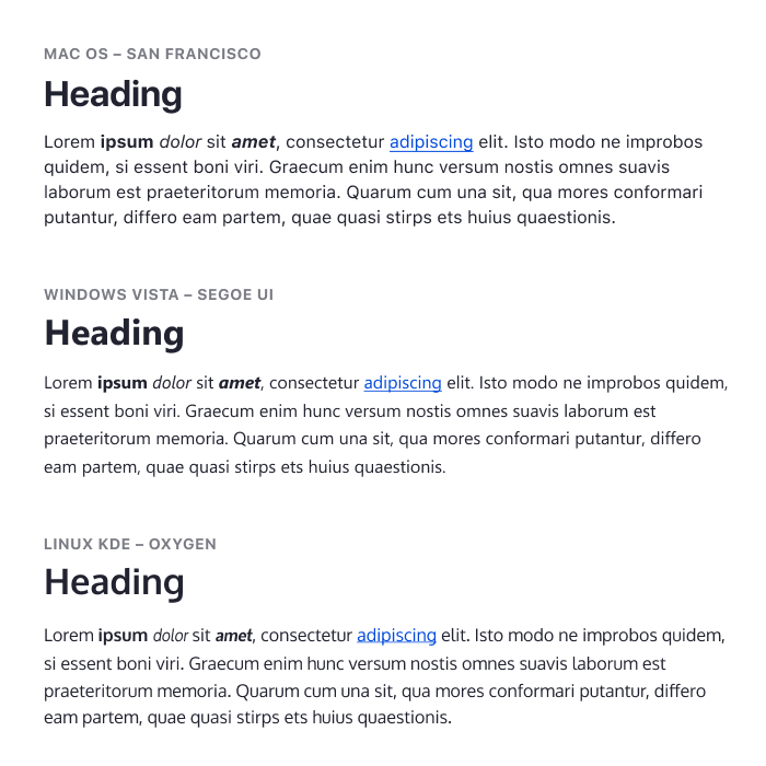
Another reason for the use of system fonts, Cristina told me, is that sometimes the font is changed to the system font anyway, for instance in other languages that are not included in the character set. Depending on the language, the range of word length is huge as well. When designing an interface like Drupal, you have to keep it flexible anyway.
“There are some languages that are short, and then there is German…”
As a last question, I asked Cristina, if she had one ultimate tip for other designers to improve their UI design. Her advice was: “Keep in mind that when we are dealing with content management UI, it is not about advertising, not about branding. UI should not be invisible, but it should serve a purpose.”
“It should serve the user needs?” I suggested.
“Exactly! The [admin] UI should be useful for creating content – in our case, because that’s what Drupal is for – instead of being super fancy.”
About Cristina and the team
Cristina Chumillas is a very experienced designer with a background in graphic design and frontend development. She has been active in the Drupal community for many years and works as Creative Director and partner at Ymbra, a Drupal web agency based in Barcelona. The other designers contributing to the Claro theme are Sascha Eggenberger, Archita Arora as well as Dennis Cohn.
Next steps
Following the work on these visual improvements, the team will continue with this user-centered approach and address functionality issues. Suzanne and I helped figure out usability problems in different CMS’s in a comparative study in November and are currently working on a follow-up study to gather more data about how editors create more complex content. Cristina told me that our findings will help guide the the user experience of the Drupal admin interface. We can’t wait to see the results of the next steps!
