
Designing a website that's both functional and attractive comes with a lot of important considerations, like whether users would intuitively connect more with turquoise or cyan, and whether either would work with the branding. However, one often overlooked but equally important element to account for in your design process is accessibility: making sure that everyone can access your site, regardless of their abilities.
It's always easier to fix things that you uncover in the design process, so it's best to consider accessibility upfront in the design process.
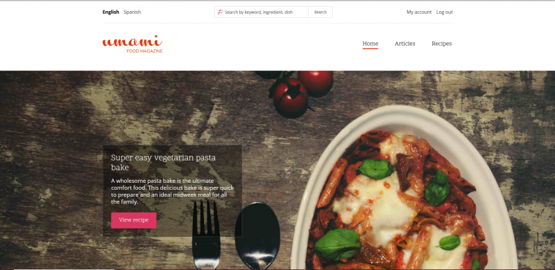
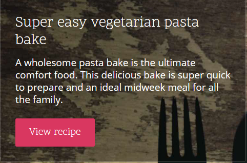
One fantastic example of accessible web design is the Umami demo site for Drupal. (Drupal is an open-source CMS that takes accessibility extremely seriously). We'll be using Umami (a recipe website) to illustrate some of the following examples.
Here are seven elements of accessible design elements to keep in mind when designing your website so it'll not only look great, but be easy to use for everyone.
1. Colour Contrast
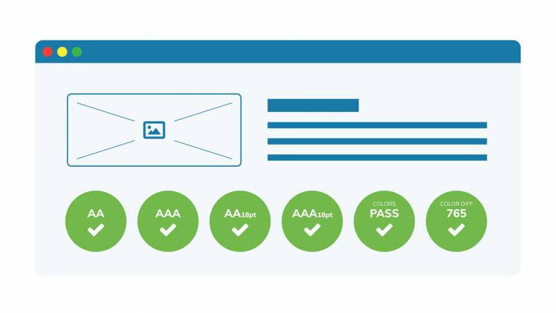
According to WebAIM, poor text contrast is the number-one accessibility barrier in the top million most visited sites. Using proper contrast between different elements of a page (e.g. text and background) is important for both low-sighted and colour-blind users. (I also appreciate good contrast when I'm trying to read my phone by the pool in the bright sun after three margaritas.)
WCAG has two standards for text/background contrast:
- Enhanced contrast, which meets WCAG AAA, refers to black-and-white contrast
- Minimum contrast, which meets WCAG AA, requires a minimum ratio of 4.5:1 for normal text, 3:1 for headings, and 3:1 for non-text content, such as icons.
The following tools can help you analyze your site's colour contrast:
- My preferred contrast checker, aptly named Contrast Checker
- TheWebAIM one
- The Colorzilla browser extension for Firefox and Chrome
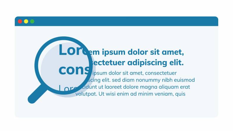
2. Hierarchy and Layout
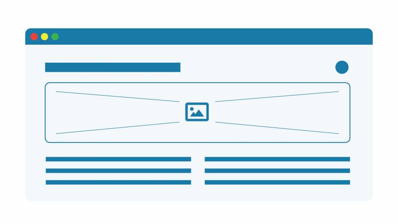
Keep the hierarchy and layout of your page logical and organized, and everyone will thank you. Make sure key information is visible at a glance and follows a consistent and coherent structure.
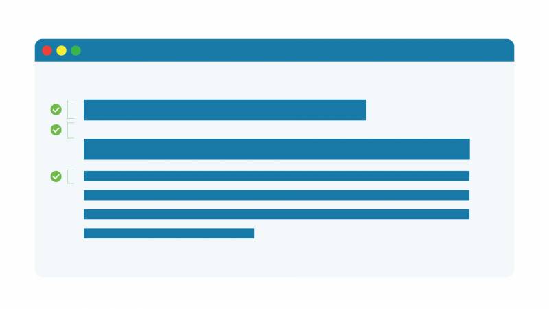
There is nothing more frustrating than having to scroll through an entire page or click a ton of links to get to the important information you're looking for. It can be even more annoying if you're using a screen reader. If you're not sure on how to proceed, here are some tips on creating accessible layouts.
Some content management systems provide consistent tools for handling structured data, making it easier to build accessible pages.
Drupal's markup is accessible by default, and also allows you to customize the structure of content as you build it out, so you can keep your site accessible as it grows.
3. Typography
Consider using a sans-serif font for longer text. Sans-serif fonts are clear and legible at any size, not to mention they scream bold and modern design.
Sans-serif fonts are so cool that I once watched an hour-long documentary about Helvetica. Or maybe that just shows how cool I am? Either way, sans-serif fonts are where it's at, because they're simply easier to read.
Also, make sure your text is large enough to read; have a text size of at last 16 px. If you need to emphasize information, bold is easier to read than italic or uppercase. Lastly, don't use stylized fonts outside of your logo.
Here's a good list of accessible fonts from Penn State.
4. Text Resizing
Ensure your text is resizable so a user who just had their glasses trampled by their Saint Bernard can zoom in on your content while looking up opticians.
Most modern-day browsers support scalability, but be sure not to inadvertently disable the functionality in your site's code. Test your site on various browsers and devices to ensure it scales properly.
You can easily achieve scalability by using relative units, such as percentages or ems, rather than absolute units like pixels or points. The Yale accessibility site has a nice guide on how to ensure text is resizable.
5. Text Spacing
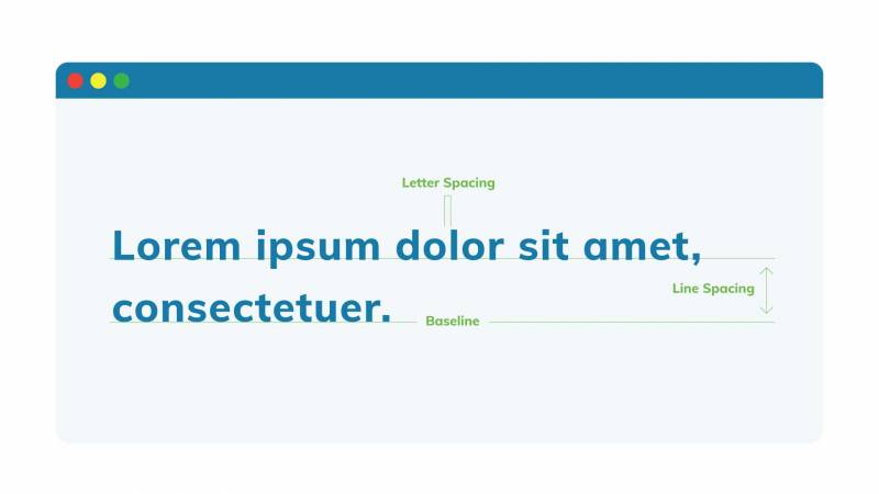
Serifs are out, white space is in. Think lovely Scandinavian minimalism. Leaving enough room to breathe between lines of text and images helps the user focus more on what is important. Some quick guidelines:
- Line height should beat least 1.5 times the font size
- Spacing following paragraphs should be twice the font size
- Letter spacing (tracking) should be at least 0.12 times the font size
- Word spacing should be at least 0.16 times the font size
If I still haven't convinced you of the importance of text spacing, this HTML Line-Spacing Guide might help.
6. Hyperlinks
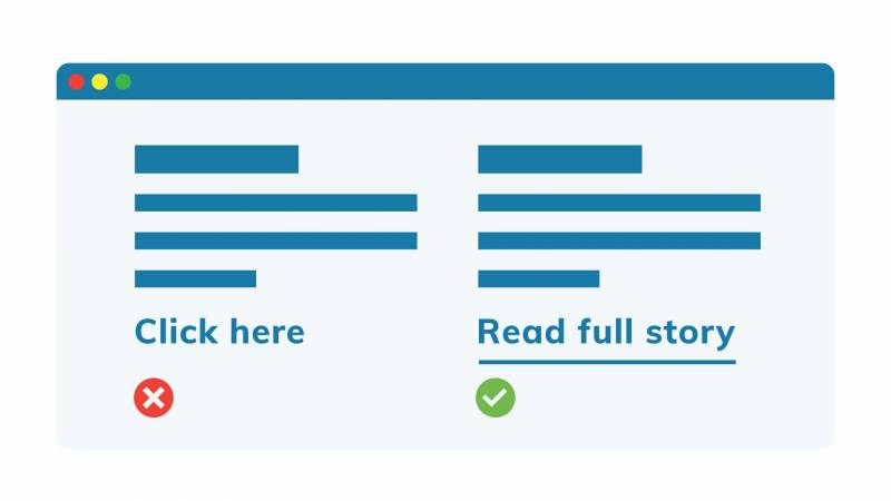
Ensure links are distinguishable by something other than colour. An underline is standard and does the job. Also, name them something useful, short and descriptive (and definitely never 'Click Here').
In navigation schemes, links pointing to the same page should be labelled consistently.
It's also good practice to warn users when a link opens a new tab or triggers a download (in the latter case, indicate the file type and size too). Again, the Yale accessibility site has a nice guide on how to make links accessible.
7. Style Focus
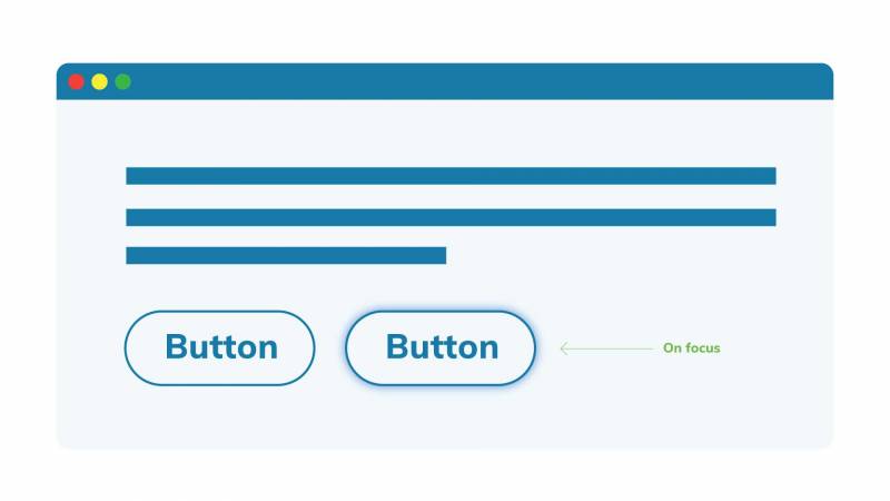
To help keyboard-only users tell where they are on a page in the absence of a mouse cursor, browsers can, by default, display a focus ring around currently focused elements.

Often, this is turned off because designers find it visually unappealing, but it can be essential to those using a keyboard to navigate your site. If you are going to remove the default style focus, be sure to replace it with something else to denote the focus.
Alternatively, have a style focus which is activated only when using the keyboard to navigate and not the mouse.
Here are some more tips on how to implement style focus.
Need More Accessibility Guidance?
If you design with these seven elements in mind, you'll be well on your way to having a site that's accessible and enjoyable for the broadest possible audience.
Want to take a deeper dive? Sign up for our course on web accessibility for a hands-on look at how to start designing and developing with a more inclusive mindset.
